
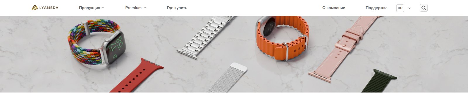
From the outside it looks like one “Choose a strap” button. Client, watch series, size, case - and here in front of you are straps that will definitely fit. On the layout it was a couple of lines in the brief. In development is one of the most stubborn modules that we have ever assembled: with long approvals, logic redesigned from scratch and edits almost until the last day before launch. Let's tell you honestly how it happened.
A task that seemed simple
LYAMBDA is a brand of electronics and accessories with dozens of models of straps for Apple Watch: steel, nylon, silicone, leather, ceramics. Apple watches, meanwhile, have 11 series (S1–S9, SE1, SE2), each series has several case sizes, and not every strap physically fits every size and type of clasp.
The brief was simple: “Create a filter so that the buyer selects his watch and sees suitable straps.” We nodded, assessed it in our heads as a task for one sprint - and, as usually happens with “simple” filters, we learned that the devil is in the details only when we sat down to draw a compatibility table.
Compatibility trap: when a filter is not a filter, but a matrix
A regular filter in a catalog works based on one or two independent criteria: color, price, brand. Here the signs turned out to be not independent. The watch series limits the available case sizes; The size of the case limits which straps will physically fit onto the mount. As soon as you showed at least one incompatible strap in the search results, the whole idea of the tool lost its meaning: the buyer lost confidence in the “selection”, rather than finding it useful.
Therefore, before drawing the interface, we actually put together a separate compatibility database - a table where each series of watches is linked to real sizes, and each size is linked to real strap items in the catalog.
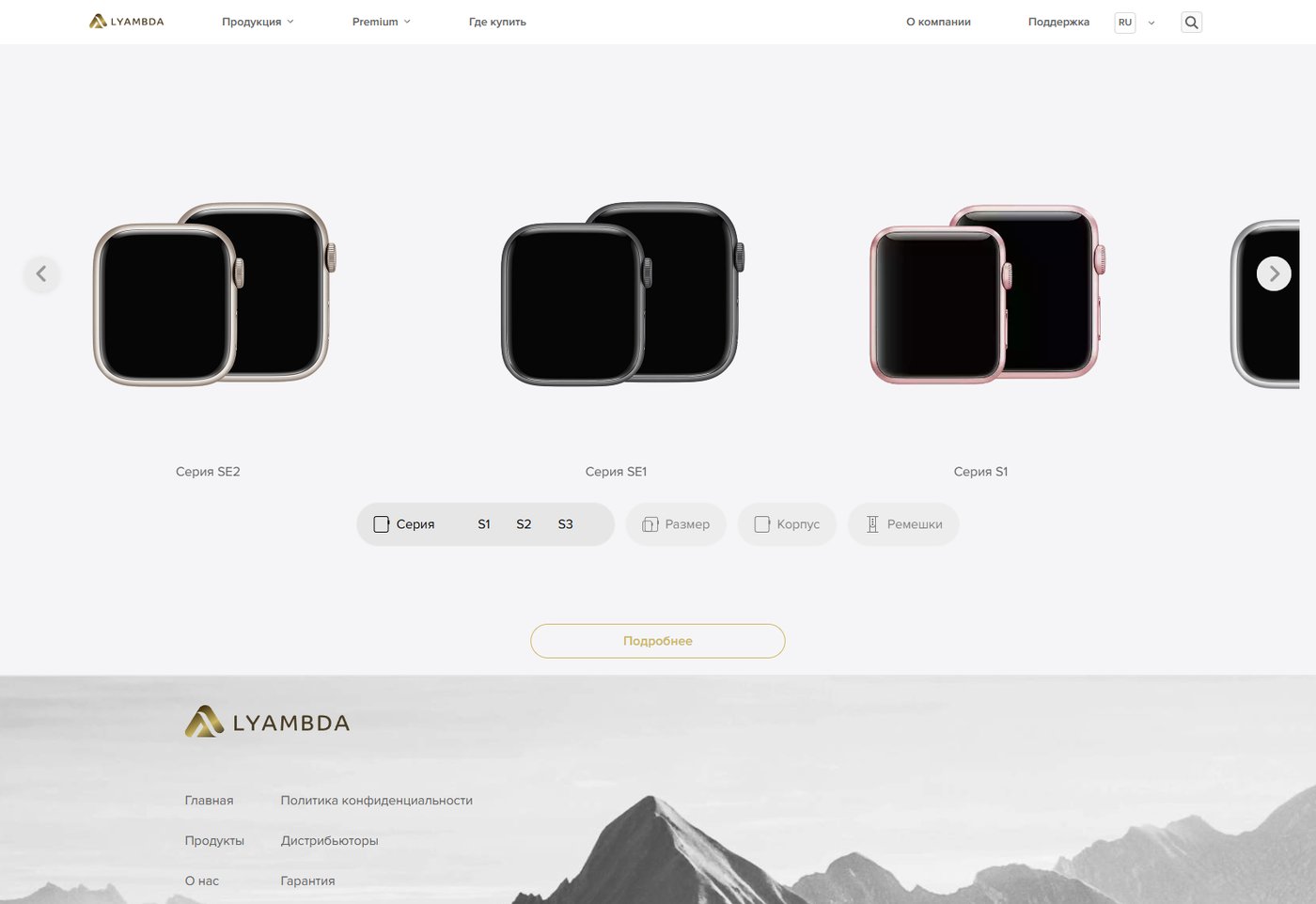
Four steps instead of one click
As a result, the interface was reduced to four sequential steps - “Series → Size → Case → Straps” - where each next step depends on the previous one, and a visual carousel of watch models spins on top. The solution itself sounds in one sentence. There is no path to it.
We rebuilt the script several times: the first version tried to show all the steps at once - and in tests people got confused about it. The second version went to the other extreme - there were too many separate screens, which is why choosing a strap felt like filling out a questionnaire. The final logic - steps unfolding one after another in one compact block - is already the third interface architecture for the same task.
Long approval process: how many rounds of edits actually took place?
Honestly: we didn’t count the exact number of iterations, but there were noticeably more edits than in an average project of this size. Part of it is essentially (how the filter should behave if there is not a single strap available for the selected size yet; how to display “premium” lines separately from the basic ones). Some are stylistic: the carousel of models changed the speed and switching method several times in order to feel “expensive” and not like a regular banner slider.
Separately, a lot of time was spent on coordinating the compatibility logic itself with the brand team - they checked the data for each series and size so that not a single “empty” or erroneous selection result would surface in production.
What happened in the end
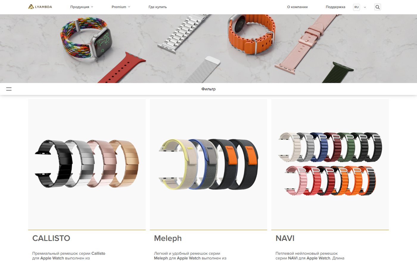
The finished tool looks deceptively simple - this is probably the main result: all the complexity is hidden inside, and the buyer simply flips through a familiar picture of his watch and receives straps that will fit exactly. Fewer erroneous orders and “didn’t fit” returns, fewer similar support questions - and one of the most non-trivial modules we collected for an e-commerce client.
What we learned from this project
- A “simple filter” in the brief and a “simple filter” in production are often two different projects in terms of labor costs if the features have mutual restrictions.
- Before designing a selection interface, it is useful to first honestly build a compatibility table - the interface will then be assembled around it faster.
- Long approvals are not always a sign that “something is going wrong.” Sometimes this is a sign that the client really checks every little detail before showing the instrument to his customers - and it's worth it.
Read more about the project itself and its tasks in the case LYAMBDA: strap selection configurator. If you also have products in your catalog with complex compatibility rules - We will analyze your problem with a free audit and show you how to solve it without causing confusion for the buyer.